
A Quick Overview of “How to Make a Responsive Website?”
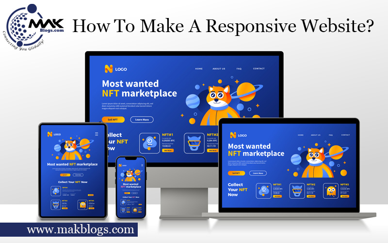
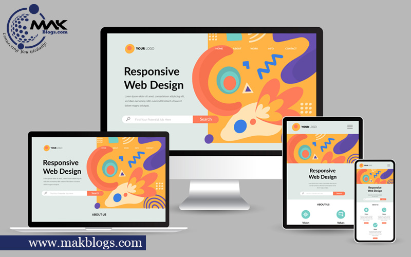
A responsive website is vital for success in the digital age. With increasing mobile usage, ensuring your site looks great on all screens is crucial. Plan and design using a grid system, simplify the design and use breakpoints. Develop a responsive framework, optimize images, and use relative units. Test on multiple devices and optimize for speed.
Examples include Airbnb, Starbucks, and Moz. Follow these steps for a responsive website that engages users effectively. These Google resources can provide valuable insights and guidance on creating responsive websites that meet mobile-friendly standards and deliver optimal user experiences.
How to Make a Responsive Website?
A responsive website is essential to a successful online presence in today’s digital age. With the increasing use of smartphones and other mobile devices, ensuring your website looks great and functions well on screens of all sizes is more important than ever.
In this writing, we’ll cover everything you need to know about how to make a responsive website.
Importance of Responsive Design
Before getting into the technical details, let’s first talk about why building a responsive website is so crucial.
Here are a few reasons:
Mobile Usage is Rising
More and more people are using their smartphones to browse the web. Mobile devices account for over half of all internet traffic. If your website is optimized for mobile devices, you could take advantage of many potential visitors.
Improved User Experience
A responsive website ensures that users can easily navigate and interact with your site, regardless of their device. This can lead to increased engagement and, ultimately, more conversions.
SEO Benefits
Google now prioritizes mobile-friendly websites in search results. Your website’s lack of responsiveness could negatively impact your search engine rankings.
Brand Consistency
A responsive design ensures that your brand identity, messaging, and visual elements remain consistent across all devices. This consistency strengthens brand recognition and builds trust among users.
Cost and Time Efficiency
A responsive design allows you to maintain a single website that adapts to all screens instead of building separate websites for different devices. This approach saves time and reduces development and maintenance costs.
Adapt to Changing Devices
With new devices constantly entering the market, a responsive design future-proofs your website. It automatically adjusts to different screen sizes, resolutions, and orientations, ensuring consistent functionality and visual appeal.
Steps to Create a Responsive Website

Planning and Designing a Responsive Website

The first step in creating a responsive website is planning and designing. A few things to remember are as follows:
- Use a Grid System: A grid system can help ensure your website looks consistent across all devices. Popular grid systems include Bootstrap and Foundation.
- Simplify your Design: A cluttered design can be difficult to navigate on a smaller screen. Keep your design simple and easy to read.
- Use Breakpoints: Breakpoints are specific screen sizes where your website layout changes. For example, you may have one layout for desktop screens and another for mobile screens. Use media queries to define these breakpoints.
Developing a Responsive Website

Once you’ve planned your design, it’s time to start developing your website. Here are a few essential tips on “How to make a responsive website?”:
- Use a Responsive Framework: A responsive framework, such as Bootstrap or Foundation, can save you a lot of time and ensure your website is mobile-friendly.
- Optimize Images: Large graphics can make your website load slowly on mobile devices. Optimize your images for the web and consider using responsive images that adjust to different screen sizes.
- Use Relative Units: Instead of using pixels for font sizes and other measurements, use relative units such as em or rem. This ensures that your website will scale properly on different devices.
Testing and Optimizing a Responsive Website

Furthermore, in the discussion of “How to make a responsive website?”. Now we will highlight the significance of testing and optimizing a responsive website. Once your website is developed, it’s important to test and optimize it.
Here are some things to remember:
- Test on Multiple Devices: Test your website on various devices, including smartphones, tablets, and desktop computers. This will help you identify any issues that need to be addressed.
- Use Google’s Mobile-Friendly Test: Google’s Mobile-Friendly Test is a free tool that analyzes your website and provides suggestions for improving its mobile-friendliness.
- Optimize for speed: A fast website is essential for user experience and SEO. Use tools such as Google Page Speed Insights to identify areas where you can improve your website’s speed.
Examples of Responsive Website Development

Let’s look at some examples of responsive website development to understand better how responsive design works.
Airbnb
Airbnb is a popular vacation rental website that uses responsive design to provide a seamless user experience across all devices. The website uses a mobile-first approach, prioritizing essential content and functionality over aesthetics.
The website’s design adapts to different screen sizes, with images and text resizing based on the user’s device.
Starbucks
Starbucks is another great example of a responsive website. The website uses a responsive framework called Foundation, which provides a structure for the website and makes it easier to implement responsive design techniques.
The website adapts to different screen sizes, with a navigation menu that changes based on the user’s device.
Moz
Moz is a marketing analytics company that uses responsive design to provide a seamless user experience across all devices. The website uses a mobile-first approach with a minimalist design that prioritizes essential content and functionality.
The website’s design adapts to different screen sizes, with a navigation menu that changes based on the user’s device.
Google’s Resources for Responsive Website Development

Google provides guidelines and resources related to creating responsive websites. Here are a few useful ones:
- Mobile-Friendly Test: Google’s Mobile-Friendly Test (https://search.google.com/test/mobile-friendly) is a tool that analyzes your website and provides feedback on its mobile-friendliness.
It highlights any issues that may affect the user experience on mobile devices and offers suggestions for improvement. - Web Fundamentals: Google’s Web Fundamentals (https://developers.google.com/web/fundamentals) is a comprehensive resource for web developers that covers various topics, including responsive design.
It offers guidance and best practices for creating responsive layouts, optimizing performance, and ensuring mobile-friendly experiences. - Mobile SEO Guide: Google’s Mobile SEO Guide (https://developers.google.com/search/mobile-sites) provides insights and recommendations for optimizing your website for mobile search.
It covers topics such as responsive design, mobile page speed, structured data, and more, helping you enhance your website’s visibility in mobile search results. - AMP Project: Google’s AMP (Accelerated Mobile Pages) Project (https://amp.dev) focuses on creating fast and user-friendly mobile web experiences.
While not specific to responsive design, it offers guidelines and resources for building mobile-optimized pages that load quickly.
These Google resources can provide valuable insights and guidance on creating responsive websites that meet mobile-friendly standards and deliver optimal user experiences.
Conclusion
In conclusion, learning how to make a responsive website is essential for providing a seamless user experience on all devices. In today’s digital age, having a responsive website is essential for reaching a wide audience and providing a positive user experience. You can build a fantastic website that works effectively on screens of all sizes by following the instructions in this guide.
Remember to plan and design your website with responsiveness, use a responsive framework, optimize your images and measurements, and thoroughly test and optimize your website for speed and functionality. With these tips, you’ll be well on your way to creating a successful, responsive website that engages and converts visitors.


16 thoughts on “How to Make a Responsive Website?”
My brother recommended I might like this website. He was entirely right.
This post actually made my day. You cann’t imagine simply how much time I had spent for this information! Thanks!
Thank you so much. Stay tuned for more.
Good day! This is kind of off topic but I need some advice from an established blog.
Is it tough to set up your own blog? I’m not very techincal but
I can figure things out pretty quick. I’m thinking about making my own but I’m not sure where to start.
Do you have any tips or suggestions? Thank you
Here are some tips and suggestions to help you get started:
Choose a Niche: Select a topic you’re passionate about and knowledgeable in.
Pick a Platform: Opt for user-friendly blogging platforms like WordPress, Blogger, or Medium.
Domain Name: Choose a relevant and memorable domain name through a domain registrar.
Hosting Provider: Select a hosting provider like Bluehost, SiteGround, or HostGator, especially if using WordPress.
Design Your Blog: Customize a theme to fit your niche or consider hiring a web designer for a unique look.
Create Quality Content: Consistently produce valuable, engaging content for your target audience.
Promotion: Share posts on social media, engage in niche communities, and network with other bloggers.
Basic SEO: Learn SEO fundamentals like keyword research and on-page optimization.
Engage With Readers: Respond to comments, emails, and messages to build a loyal readership.
Monetization (Optional): Explore monetization options such as affiliate marketing, sponsored posts, or selling digital products.
Building a successful blog requires time and dedication. Keep learning and refining your skills, and your blog will grow over time. Good luck with your blogging journey!
I for all time emailed this weblog post page to all my friends, since if like to read it afterward my links will
too.
Thank you. Stay tuned for more.
Aw, this was an extremely good post. Finding the time and actual effort to make a really good article… but what can I say… I procrastinate a whole lot and don’t
seem to get nearly anything done.
Thank you. Stay tuned for more.
interesting for a very long time
Thank you. Stay tuned for more.
interesting for a very long time
Thank you. Stay tuned for more.
thank you very much
Thank you. Stay tuned for more.
interesting news
Thank you. Stay tuned for more.